
Liquid Glass: Apple’s Design | 매거진에 참여하세요
Liquid Glass: Apple’s Design
#apple #design #policy #paradigm #liquid


WWDC 2025: Apple’s Vision for the Future of UI Design
Why Liquid Glass Is More Than Just a Pretty Interface
When does a design language change?
That question may sound abstract, but Apple has always given a clear answer through action—not words.
The shift happens when a new paradigm emerges.
In 2007, skeuomorphism defined the first iPhone—a visual metaphor of reality.
By 2013, flat design in iOS 7 reflected the rise of minimalism and touch-first interaction.
Now, at WWDC 2025, we enter a new era: Liquid Glass.
It’s not just a visual refresh. It’s a recalibration of how we interact with digital environments in the age of AI and spatial computing.
Apple isn’t simply updating how things look—it’s redesigning how they feel.
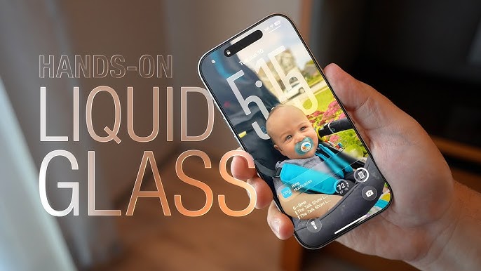
What Is Liquid Glass?

Unveiled at WWDC 2025, Liquid Glass is Apple’s boldest redesign in over a decade.
It’s a design language inspired by transparency, fluidity, and context-aware behavior.
Think of it as glass that breathes—interfaces that reflect light, shift with motion, and subtly adapt to your environment.
This isn’t skeuomorphism 2.0 or a flat design redux.
It’s a responsive, spatial UI that considers your surroundings, device posture, and ambient light in real-time.
Key principles of Liquid Glass:
- Transparency – layered UIs that reveal rather than obscure
- Refraction & Reflection – mimicking the behavior of light on glass
- Dynamic Responsiveness – elements react to motion, touch, and context
- Contextual Awareness – UI that shifts based on time, place, and activity
It’s a total departure from layer-based design. Instead, it embraces a spatially aware interface
—blending digital surfaces with physical environments.
A Unified System: How Liquid Glass Works Across Devices
For the first time, Apple is rolling out a new design language across its entire ecosystem at once. Not gradually, not selectively
—every OS, from iPhone to Vision Pro, gets the Liquid Glass treatment.

iOS 26 & iPadOS 26
Lock screens and widgets now shimmer with translucent depth
Notifications and control panels dynamically adapt to the background
Core apps like Camera and Messages feature redesigned, glassy UIs
macOS Tahoe
Sidebars, docks, menus, and widgets now feel tactile, like etched glass
Developers can access new APIs through SwiftUI (e.g.,
.glassBackground()Depth between windows and layers is enhanced with subtle blur gradients
watchOS 26
Even on the smallest screen, glass effects enhance liveliness
Watch faces react to wrist movement and surrounding color tones
tvOS & visionOS
Apple TV’s UI plays with light, motion, and translucency for immersive content browsing
Vision Pro’s interface shifts color and clarity based on your physical space
This isn’t just consistency—it’s convergence. Liquid Glass isn’t just visual glue;
it’s the connective tissue that bridges Apple’s spatial computing vision.
Why Now? The Timing Behind Liquid Glass
So why is Apple shifting its design language in 2025?
1. The Rise of AI and Spatial Computing
With the debut of Apple Intelligence, Apple’s version of personal AI, interfaces can no longer be static. AI isn’t just answering questions—it’s guiding users through time, space, and intent. UI must be fluid, predictive, and responsive to the now.
2. Design as a Bridge Across Devices
From phones to headsets, switching devices should feel seamless. Liquid Glass is Apple’s answer to the cross-platform dilemma. While form factors and gestures differ, the visual language remains unified.
3. Hardware Finally Caught Up
Thanks to Apple Silicon’s latest GPU capabilities, real-time blur, reflection, and animation effects are now effortless. For the first time, design doesn’t need to wait on hardware. The ceiling has been lifted.
The Good, the Bad, and the Glossy
Liquid Glass has captivated designers and users alike—but not without critique.

Pros
- Visually responsive UI that adapts to user behavior
- Consistent design language across devices reduces learning curve
- Maximizes the immersive potential of spatial computing (especially Vision Pro)
Cons
- Excessive transparency may hinder readability
- Accessibility concerns: not ideal for users needing high contrast
- Critics say it’s “Vista Aero rebranded,” questioning substance over style
Still, Apple’s philosophy remains rooted in purposeful aesthetics. Beauty is never the end goal—it’s the gateway to intuitive experience.
What It Means for Developers
Apple didn’t stop at design—it reengineered the developer experience too.
SwiftUI introduces new modifiers for blur, reflection, and context-awareness, making it easier for developers to implement Liquid Glass natively.
New tools include:
.glassBackground()– allows layered transparency in viewsdynamicBlur()– context-reactive blur levelsEnhanced compatibility with ARKit and RealityKit for spatial interface design
It’s clear: Apple doesn’t see design as decoration—it sees it as code, as the product itself.
The Philosophy: Why Glass Again?
As technology becomes more complex, its interface must become more transparent.
Complexity should never be the user’s burden. That’s the core philosophy behind Liquid Glass.
This isn’t just a glossy effect—it’s a statement.
A declaration that in the age of AI and ambient computing, design must be light, fluid, and invisible when necessary.
We’re not tapping on buttons anymore—we’re moving through environments.
Liquid Glass is the surface between us and the machine—and it’s finally becoming as natural as looking through a window.

- link_kakaolink_kakao_url
- link_operatorlink_operator_url
- link_investhelp@letspl.me
- link_ad_urllink_ad
